Monday, 6 December 2010

Monday 6th December 2010: Front Page Development

Here is the screenshot development of my Front Page for my Newspaper:

As you can see I have started with the Masthead, adding in the Logo.


Here, I have added the Price and Date, beneath the Masthead.


I have added in the Sub-Headline as part of the sports section. I will include a picture in here. I have also used the Fonts I have looked at in previous posts.


I have added in the Main Headline/Story and the sub-headline. As you cna see, aI have changed the background of the Sports section to black, to establish that they are different storys/sections.


Here I have included a close up of the story and the Sub-heading. As this is my first draft, I am going to show what changes I am going to make in my next post.


Friday, 26 November 2010

Friday 26th November 2010: Planning Continued & Fonts


I have edited the main front page picture to get rid of the headroom at the top and the clutter in the background.

When I have designed the front page, I plan on getting it printed off and blown up to A3, so I can look at areas I need to change, Pictures that need improving, etc. I plan on then scanning that into my blog, typing up where I can make changes.


Masthead Font Planning
These are the fonts I have looked at for my Masthead. This will be the Logo/Branding for my newspaper, which will feature on the poster I will be creating for the newspaper further on in the portfolio. I have used a variety of different fonts, Sans-serif and Serif, and included my logo in the middle that I have designed.


After looking at each font, I have decided to choose this one as my final design:


I have chosen this design because I think out of all of the fonts, I stands out to me the most. I also think it goes well with the logo in the middle. It is bold,and in capital letters, so as well as standing out to me, it would also stand out if it was in a shop, for example, or on a newsstand. The font is "Super Black SF" and is in normal. I also think because Local newspapers are featured in colour, the logo in the centre is a good way of showing that, and including it in my design.


Headline & Story Fonts


These are the fonts I have decided to use for the rest of the front page/2nd page. The Headline & Sub-heading fonts are the same, accept the Headline is in capital letters. I have done this to show the reader the difference between the sub-heading and the heading. Both the headline and sub-heading are Serif. The story font is sans-serif. Again, I chose this to show the difference between each of the sections.


Thursday, 18 November 2010

Thursday 18th November 2010: Photographs

These are the Photographs I have taken for my Main Story on the front page and my Article on the same Story, inside. I have taken a number of photographs to choose from,and I will decide which I think will be most suitable for my Newspaper. After I have chosen my Photographs, I will look at Fonts for the Mast Head, etc. The photographs are to illustrate the young, local girl, being accepted into a top drama school.

I think that this picture is most suitable for the front page, as it matches up perfectly with the headline.

The Mise-En-Scene of the picture is in a Drama Studio. I did this so it fits in with the story, and continues the theme. The girl in the picture is the local girl "Roxanne" who has been accepted into the London Drama School. She will be in each picture.

I have chosen this one because it is in Portrait format, which is more appropriate. Also I will crop the photo, to reduce headroom and remove background clutter.


I have included photographs of "Roxanne" acting in the drama studio, including other students. Again, with the mise-en-scene of the Studio.


I asked the students that were photographed in the picture to practice their play that they were working on, whilst I took pictures. I took a number of photographs, so I had a selection to choose from. I noticed on National News Channels that there was alot of flash photography when something interesting was happening, and discovered that photographers don't stop taking pictures to gain a choice of them for their report.


Additional Pictures


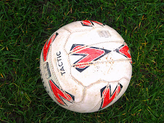
These pictures are additional pictures that will feature in my newspaper. The football is for the Sub Headline of the Sports Section on the front page, and the school is for the article, stating where 'Roxanne' goes to school.

Sunday, 7 November 2010

Sunday 7th November 2010: Picture Planning/Sketches (Front Page)

Logo

These are the skeches for the planned photographs that will be featured on the front page of my Local newspaper. ( Sketches for my inside page will be later on in my blog)


First of all, this is my Logo for inside the masthead on my front page. The emblem will be done on computer, and then put onto the cover of the newspaper, titled "The Local"


Main Story Photograph

This is the picture that will feature with my Main Headline/Story. The Headline will be
"Local Girl accepted into London Drama School"
and the Sub-headline will be
"Roxanne of *location* attending London School For The Arts next Autumn"
This story will be developed in my second page of the newspaper I am creating. I think it is important that the main story on the front page is a local story, as it emphasizes the fact that it is a local newspaper. Particularly if it is of a young local, who is achieving something. It represents the youth of that area.


Sports Story Photograph

This picture will be a part of the 'Sports Section' of the front page, and will feature the heading
"Team triumphs to top of Local League", with
"Continued in Sports Section, Back Page" written underneath.
Again, I think it is important that I focus on Local team sports, as opposed to National.

I plan on taking these photographs with a digital camera. I will visit the Drama Department of my school, asking if anybody is willing to be photographed for my newspaper. I will also ask if I can photograph the Drama Studio, as a possible picture for the Second page of my newspaper.
For the sports picture, I will approach one of my friends who plays football, and ask if he will be photographed.

Monday, 18 October 2010

Monday 18th October 2010: Layout Scans

Here are some layouts that I have drawn out for my Newspaper front cover. I have drawn out three different layouts that I may use, and I will choose at the end which I think is best suitable for my Local Newspaper:
Layout #1

I have featured all of the typical newspaper elements, including Masthead, Headlines, Bylines, Captions, Pictures, etc.
This Layout features an emblem (like shown on The Daily Post newspaper, in my Research) in the Masthead (the line below will feature the date and price).
A Quarter of the page will feature a story headline, with a picture.

The majority of the page will be taken up by the Main story. There will be the Headline, Subheadline, and byline. The story will then feature 5 columns, with a 'continued on page.." line in the bottom right hand corner. There will also be a colour picture (I will sketch the plan of the pictures, then scan into here) with a caption beneath.


Layout #2

Again, I have used all of the main elements of a newspaper.
I have made the main headline story in a bigger area, but only including two columns for the story, as well as a picture. I have featured a byline, and a sub headline, as well as 'continued' at the bottom of the page, with a caption underneath the picture.
Again, I have used a quater of the page for a different story, possoibly related to sports, with a picture.


Layout #3

In this layout, I have featured the main headline directly underneath the masthead. This could represent the story as big news, as there is no other news before it. It features 3 columns and a picture in colour.
Underneath the main headline, I have featured a section for another headline, possibly a smaller story, or part of the sports section. There will be just a headline and sub headline in this, with no article featured for continuation.


The layout I have chosen for my piece will be Layout #1. I have chosen this particular layout as i think it shows more depth into the main story I will feature, as well as a section for 'sports', which I am going to feature. The sketches for the pictures will be scanned into my blog, and analysed, explaining why I have decided this picture will be suitable for my newspaper.

Monday 18th October 2010: Planning Photographs & Storys

Today I am going to be focusing on the photographs. For my two pages of my Local Newspapers, It is important for me to feature photographs of the story I will be putting into the paper. By doing this, I need to plan out who I will take pictures of, Where the pictures will be taken, and what they will be of, as well as what the story will be about. After Researching into the different types of newspapers (Local & National), I have seen the difference in photographs featured in each of these types of Newspapers.

Story

First of all, there are going to be three stories that will be featured in my work: Two featured on the front page, The one main story article inside, on my second page, which will be continued from the main story on the front page.

Front Page Story
The front pages main story is going to be local Teens success in getting into a top London School, I have decided this because I think it creates more of a local feel to my newspaper, and helps to stick with the Genre of Local Newspaper. I also think it is a Positive story and helps to attract the teenage Specific Audience I have chosen. The second story is going to be below the Masthead, which will be about, local team sport which will be 'continued at the back'. This means I will need to photograph a close up of a team playing a sport, which will be Football or Rugby. I will be looking at Layouts, so some of this may change.

Main Story Inside
The main story I will be featuring on the second page will be a continuation of the Main Headline on the Front Page. This will mean I will need to photograph a teenager, possibly outside a school, etc. I will look at this idea further on.

Monday 18th October 2010: Target Audience

Target Audience

After looking at my Codes & Conventions for Local Newspapers, I have concluded that my Target Audience for my Local Newspaper is, of course, going to be Local People in a Community.

Specific Audience

The specific audience for this newspaper is going to be All ages, but the article I will feature will be based on a Teenagers success, so it could appeal to them. After conducting my questionnaires, which were given to youth ages 14-21, I found that they didn't really think there was much news about teenagers, and what is going on in their community, so this is why I think the teenager front page story would be a good idea. I think it will attract the target audience if it was real, and the teenagers would see the story on the cover, seeing it is about success (which the questionnaires showed that Success was a common story in their local papers) and teenagers. I will also have a Sub-headline that will contain possibly sports, that will attract local sports fans. Overall, the Target Audience is local community, but the Specific Audience is Local Teens.

Sunday, 17 October 2010

Sunday 17th October 2010: Research For Second Page of Newspaper

I have previously looked at the Codes & Conventions for the front page of a newspaper, which will be my first page. My second page is going to be an Article page, which is what I am going to be looking at now, again, looking at both Local and National Newspapers.

National

I have taken this page from The Daily Mail Newspaper:

  • As you can see here, the newspaper features the Date in the top left hand corner.
  • The newspaper article is split into columns, which is typical of a newspaper to do.
  • It features a Headline, which is at the very top of the page, and below it, in between the two pictures, a Sub-Headline, giving a brief as to what the article is about.
  • The page is in Black & White, but features a colour advertisement in the bottom right hand corner.
  • The story is broken down into 3 sections in columns.
  • The byline Features who the article is written by, and is located underneath one of the pictures.
  • As you can see, there are two pictures that are featured on this page, both with captions explaining what the picture is about underneath.
  • The story is about Darwin, so it is about History, as apposed to a Local Story. It looks like it could be general knowledge.
  • The font for the Headline and Sub-headline is in Sans-Serif (this may have been done to make it easier to read)
  • Reasons for this article being in the newspaper at the time could be that the "Tantalising Private Papers" were released to the public.

Local
This newspaper has been taken from Sunshine Coast Daily:

  • The newspaper, like the National newspaper I have looked at, features the Headline at the top of the page, with the Section of the paper it is in, 'Entertainment' written above it.
  • The Sub-heading is featured left of the picture
  • The picture, unlike the National newspaper looked at, is in Colour.
  • It features 4 columns, but is only in 1 section, unlike the National Newspaper, which is in 4 sections.
  • The Byline is featured below the Sub-heading
  • There is a caption underneath the picture, explaining the picture.
  • The story is about a Local singer, achieving something. This is important news to a Local area, as it shows that people in their community are succeeding.
  • The story may have been reported to show local support to the singer, showing the community what has happened to her.
  • Again, the font is in Sans-Serif, making it easier to read.
Both National and Local newspapers show important storys. I think that the local newspaper shows more important news to the local community that it is aimed at, and I want to try and include a story like this in my newspaper.

Wednesday, 8 September 2010

Wednesday 8th September 2010: Research into Local/National Newspapers- Compare & Contrast

For the research if my newspapers, I am going to be looking at newspapers from my local area, as well as other areas, and using scans to analyse them, Looking at different layouts, mastheads, etc. I will also be looking at the content, Whether or not the newspaper has included international news, or just news from around the area, whether or not there is advertisements, etc. The scans are from local newspapers "The Daily Post" and "Daily News".

The Daily Mail is a daily newspaper that is from the North Wales Region.

The Date and Price are featured underneath the Masthead, as well as the Sub-title.

As you can see here, this newspaper has been printed in Colour, the Masthead in Blue, with the Welsh Dragon in the centre. It is in Sans-Serif, as is the rest of the headlines and sub-headlines on the page.

The front page is split up into 3 sections: The Main Headline (bottom), and two Sub-headlines that are placed at the top.

The Main headline shows some of the article, then procides to say "FULL STORY- P5". This is to attract the audience to the main headline,giving them half of the story, therefore they will buy the newspaper to read the rest

Underneath the short, Main Headline, the sub heading is featured, which is smaller, giving more detail to the main header.

The page also features colour pictures, one in every section, to go into the storys in more detail.

The news in this newspaper is just from that specific area. It may feature world-wide news inside, but on the cover the news is only related to the area it sells in.

The pictures on this newspaper are of local people (the two pictures at the top) with their own story, a Man, who sadly died in a sporting event, and a woman who was related to a victim of violent crime. The third picture, which is part of the main headline, is of a local area where a tragedy has happened. By putting a picture of the area where a story has happened, it will attract the target audience (local people) to read the newspaper, as they may live or know the area where this has happened.

This is a small town, local newspaper that covers a small area, therefore the audience can relate to what is being reported, whether they know people in the news, or were apart of the story, or just want to know about the news in their area.


Although this is still a local newspaper, the news on the page is worldwide, whereas the news on the previous newspaper was just local.

The cover for this newspaper shows just one story. Although it is specific to the place it is sold it, It is world wide news, that everyone knows about. It is also a Splash, as it is the main headline.

The masthead is alot like the previous one, with the emblem in the middle. It is in Serif writing, in Black, which is different to the previous local paper.

The rest of the writing on the page is in Sans-Serif, which is the same as the previous local newspaper, as all of the writing on that was Sans-Serif.

This story is clearly important to the place it is sold. The paper has dedicated the front page to this one story. It is specifically talking about the man on the cover.

As apposed to writing half of the story on the front page, the paper has just written the headline and then written "SEE PAGES 4-7 & EDITORIAL".

The black background seems to be a representation of evil, as usually the writing is in black, the background in white. The newspaper has clearly stated that this man is evil, with the headline it has used, so the black background is a representation and symbol of this.

Again, in comparision to the previous newspaper, the date, price and Sub-title of the newspaper are featured underneath the masthead.

The picture here has been used to grab attention, as the newspaper has shown that the man on the page is an important figure to the news at that time.

Monday, 5 July 2010

Monday 5th July 2010: Questionnaire Results

After collecting my data via. Facebook, I made graphs for each of the questions. Here I have evaluated each graph and the answers I received.


Question 1

As you can see here, the highest amount of people is 6 out of 10. This means that 6 out of the 10 people asked never buy there Local Newspaper. This could mean that their Local Newspaper is free, as some are. The rest of the numbers are low. Could this possibly be because the news in Local
Newspapers don't feature news that the age group
find interesting? If local teens were featured
in Local Newspapers more, would they buy it ?


Question 2

This graph shows the type of news reported in Local Newspapers. As you can see, the most news reported is Success. I would like to incorporate Success into my newspaper, as I think it is a positive thing to be looking at in Local
Community's, when someone achieves something never before done by someone in the area.


Question 3

This graph shows the answers to "Do you think Local Newspapers Offer news for a wide range of Ages?". As you can see, the majority of the people answered No. This could be because the people asked were 14-21 year olds, therefore what is in the news may not appeal to them.


Question 4

6 people believed their local area was seen in the right light, whereas 4 didn't . This could be because the people asked were all from different areas, and could have different opinions.


Question 5

This question I think is important to the age group I asked. The age group I asked were either in school/university or been in school/university, therefore they would know if the schools in their local area had been featured in newspapers.


Question 6

Lastly I asked if they were happy with the service provided by their Local newspaper. 8 out of 10 people said they were happy. 2 people said they weren't. This could be because the news being reported wasn't what the age group questioned was looking for.

Friday, 2 July 2010

Friday 2nd July 2010: Research using Questionnaire

Questionnaire

Here I have prepared a questionnaire, researching into the type of news people see in their local newspapers. I have tried to base the questionnaire on the news I want to feature in my local newspaper. I will turn my answers into graphs to represent my findings. My Target Audience for the questionnaire is 14-25 year olds. This is because I think my main story will involve a high school student. To distribute my questionnaire, I plan on using Facebook. I think this is a good way to reach the target audience and easier for them to fill it out. It will make it a quicker and easier process for me also, to have all the information stored, therefore I won't have to transfer any over from paper to the computer. I will ask 10 people. My results and graphs will be shown on the next post.
____________________________________________________________________
Local Newspaper Questionnaire

1) How often do you buy your local town newspaper?
-everyday
-1-3 days of the week
-3-7 days of the week

2) What kind of news do you think your local paper features most?
-business news
-crime in the area
-local sport
-local success
-other______________

3) Do you think your newspaper offers news for a wide range of ages?
-Yes
-No

4) Do you think the local newspaper sees your local area in the right light? (For example; Are some areas represented in a bad way, crime, etc)
-Yes
-No


5) Does your newspaper recieve news on local schools?
-yes
-no

6) Lastly, are you happy with the service your local newspaper provides?
-yes
-no

Thank you for completing this questionnaire
____________________________________________________________________

Monday, 28 June 2010

Monday 28th June 2010: Codes & Conventions Of Local/National Newspapers

Here I have a image of a local newspaper in my area. I am going to be looking at the Codes and Conventions of local newspapers/newspapers in general. Newspaper Codes & Conventions are the points that create a typical newspaper look, for example, the 'Red Top' newspapers are the newspapers that feature the name of the newspaper in a red box at the top, with the date, and Price underneath. Examples of 'Red Tops' are The Sun, The Mirror, and the Daily Star. These types of newspapers feature celebrity news, as well as some International news. There is also the 'Broadsheet' newspaper. These are usually the middle-upper class stereotypical newspapers that feature world news, with financial and business news. Examples of these newspapers are The Times, The Observer, and The Guardian.

Codes and Conventions of Newspapers

  • Masthead, usually in colour for local newspapers, for example the Echo is in red, The Daily Post is in blue, unlike broadsheet newspapers like the Times, or The Mail, which are in Black.

  • Seperated into sections, main headline, bold, big writing, then other headlines that are smaller, around the page, with some pictures.

  • Banner underneath the Masthead, with Date/Price/Area Sold written in.

  • First sentance of the Main headline article in Bold. then normal, then "continued on Page.." etc.

  • The Main headline is a big story, to draw attention to the Audience. The headline is local news (like the whole newspaper) and includes news that is dramatic and unexpected in the area, so it is attracting local area readers.

  • Byline is the line that is underneath the article that has been written, that states the name of the writer.

Local Newspaper Codes & Conventions

Local newspaper Codes & Conventions are mostly the same as the previous list of Codes and Conventions.

  • An Advertisement Section, usually including Cars, Items people are selling. As well as Houses for Rent/Sale in that specific Area
  • Local Stories (as well as national stories)
  • Local Sports, usually located on the back pages, featuring Local Team News. Along with some National Sporting News.
  • Birthday/Obituary Section for Local people.

Tuesday, 22 June 2010

Tuesday 22nd June 2010: Brief

I have decided on the Brief I am going to do for this peice of coursework, and that is:

The First two pages of a new local newspaper, together with two of the three options:
  • A Poster for the newspaper*
  • A Radio Advertisement for the newspaper*
  • Two hyperlinked pages from the paper's website

*- These are the two options that I have chosen for my coursework, along with the first two pages of the newspaper.

The mediums for my chosen Brief are Audio and Print, and I will require audio equiptment for the Radio Advertistment. The purpose for the Newspaper is to bring news to people. In this case,It is local news, and therefore I am going to create a newspaper that will attract locals from a town/community. I will write about my target audience further in my Research/Planning. The Newspaper will include things that are affecting locals in a town or community.

I will be doing my work in this order:

  • Local Newspaper Work
  • Poster for Local Newspaper (A3)
  • Radio Advertisement

I will be using this blog throughout all of my work, As I have experience using a blogger from last year. My photographs, Sketches, and any other work will be scanned and put onto here.

The two pages that I will be creating for the Local Newspaper are going to be the Front page, and an Article Page.