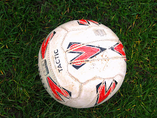
I have edited the main front page picture to get rid of the headroom at the top and the clutter in the background.
When I have designed the front page, I plan on getting it printed off and blown up to A3, so I can look at areas I need to change, Pictures that need improving, etc. I plan on then scanning that into my blog, typing up where I can make changes.
Masthead Font Planning
These are the fonts I have looked at for my Masthead. This will be the Logo/Branding for my newspaper, which will feature on the poster I will be creating for the newspaper further on in the portfolio. I have used a variety of different fonts, Sans-serif and Serif, and included my logo in the middle that I have designed.

After looking at each font, I have decided to choose this one as my final design:

I have chosen this design because I think out of all of the fonts, I stands out to me the most. I also think it goes well with the logo in the middle. It is bold,and in capital letters, so as well as standing out to me, it would also stand out if it was in a shop, for example, or on a newsstand. The font is "Super Black SF" and is in normal. I also think because Local newspapers are featured in colour, the logo in the centre is a good way of showing that, and including it in my design.
 These are the fonts I have decided to use for the rest of the front page/2nd page. The Headline & Sub-heading fonts are the same, accept the Headline is in capital letters. I have done this to show the reader the difference between the sub-heading and the heading. Both the headline and sub-heading are Serif. The story font is sans-serif. Again, I chose this to show the difference between each of the sections.
These are the fonts I have looked at for my Masthead. This will be the Logo/Branding for my newspaper, which will feature on the poster I will be creating for the newspaper further on in the portfolio. I have used a variety of different fonts, Sans-serif and Serif, and included my logo in the middle that I have designed.

After looking at each font, I have decided to choose this one as my final design:

I have chosen this design because I think out of all of the fonts, I stands out to me the most. I also think it goes well with the logo in the middle. It is bold,and in capital letters, so as well as standing out to me, it would also stand out if it was in a shop, for example, or on a newsstand. The font is "Super Black SF" and is in normal. I also think because Local newspapers are featured in colour, the logo in the centre is a good way of showing that, and including it in my design.
Headline & Story Fonts
 These are the fonts I have decided to use for the rest of the front page/2nd page. The Headline & Sub-heading fonts are the same, accept the Headline is in capital letters. I have done this to show the reader the difference between the sub-heading and the heading. Both the headline and sub-heading are Serif. The story font is sans-serif. Again, I chose this to show the difference between each of the sections.


